10 High-Converting Ebook Landing Page Examples
See 10 real ebook landing pages, free and paid, from big brands and small creators. What each does well, what to copy, and how to build your own. Checked October 2026.
 By Philip Ghezelbash
An ebook landing page is a single page with one job: get a visitor to download your ebook for free or buy it. The best ones are short, say exactly what the reader gets, and ask for as little as possible.
Below are 10 real ebook landing pages, checked in October 2026. Five come from solo creators, authors and small shops: three give the ebook away and two sell it. Five come from big brands that give ebooks away for an email. For each one you get the headline, what the page does well, and what you can copy. We also say what not to copy, because a page from a company with a famous name works for reasons you do not have yet.
One honest note: we cannot see these pages’ conversion rates. We chose pages that use the parts listed below, which are the parts the research on landing pages supports.
What makes an ebook landing page work
Every page below, big or small, uses most of these parts. They match what Unbounce, CXL and Kit list as the basics.
- A headline that says what the reader gets. A clear promise beats a clever line.
- A cover or mockup. It shows the reader what they are getting. Builders and brands recommend it, but we found no study that measures how much it helps, so we do not claim a number.
- A short list of what is inside. Four to six specific bullets, written as results rather than chapter titles.
- A short form, or a buy button. Ask for what you need and nothing more.
- Proof. A real number, a short bio, a quote from a reader or a refund promise.
- One button, repeated. No menu bar pulling people away.
- A layout that works on a phone. Most visits are on mobile (more on that below).
Free ebooks from creators and small businesses
1. Justin Welsh: a free 30-page guide
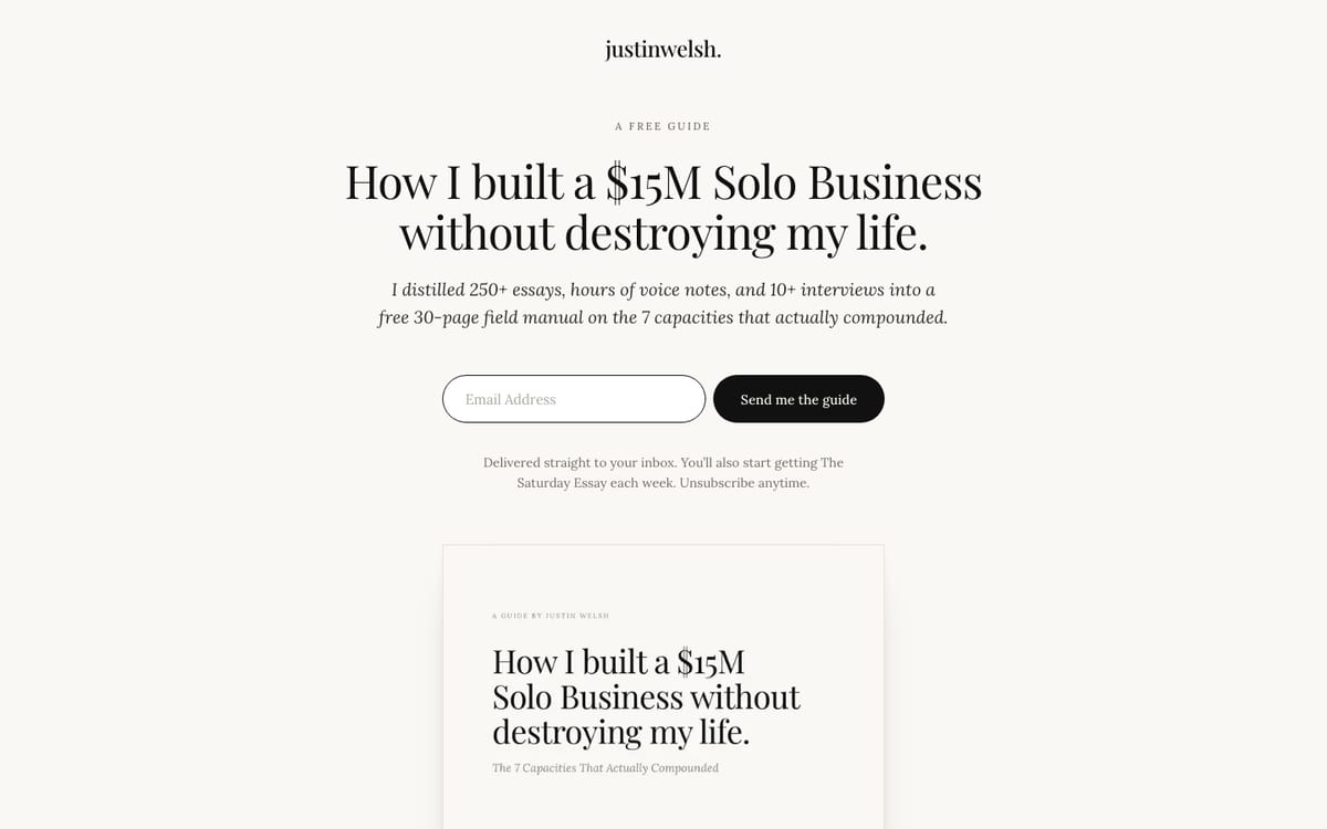
Page: justinwelsh.me/guides/fifteen-million-solo
Headline: “How I built a $15M Solo Business without destroying my life.”
Sub headline: “I distilled 250+ essays, hours of voice notes, and 10+ interviews into a free 30-page field manual on the 7 capacities that actually compounded.”
Button: “Send me the guide”, repeated at the bottom under “Get your free copy.”
What it does well: The headline is the promise, and the sub headline is the proof of effort. It names the page count (30) and the number of ideas (7), so the reader knows the size before they sign up. A list of the seven ideas shows what is inside. A two-sentence bio gives a reason to trust him, and a line under the button says what else you get: “You’ll also start getting The Saturday Essay each week. Unsubscribe anytime.” The whole page is one short scroll.
What to copy: Put the length and the number of ideas in the headline area. Add one honest line about what happens after signup.
Keep in mind: He writes to around 200,000 readers, so his bio carries weight yours may not yet. Use a true credential of your own, even a small one.
2. Joanna Penn: a free Author Blueprint

Page: the-creative-penn-limited.kit.com/blueprint
Headline: “Sign up for your FREE Author Blueprint”
Button: “Yes, send the Blueprint!”
What it does well: Plain and direct. Three short blocks (Writing a Book, Publishing Tips, Book Marketing) list exactly what the freebie covers. The page says what else you will get (“bi-monthly updates”) and ends with a privacy line and a link to the privacy policy.
What to copy: Name the item on the button instead of writing “Submit”. Add a one-line privacy note near the form.
Keep in mind: We could not confirm whether the Blueprint is a PDF ebook, so treat it as a free starter resource. The form asks for an email address only.
3. Teaching Heart & Soul: a free classroom management ebook
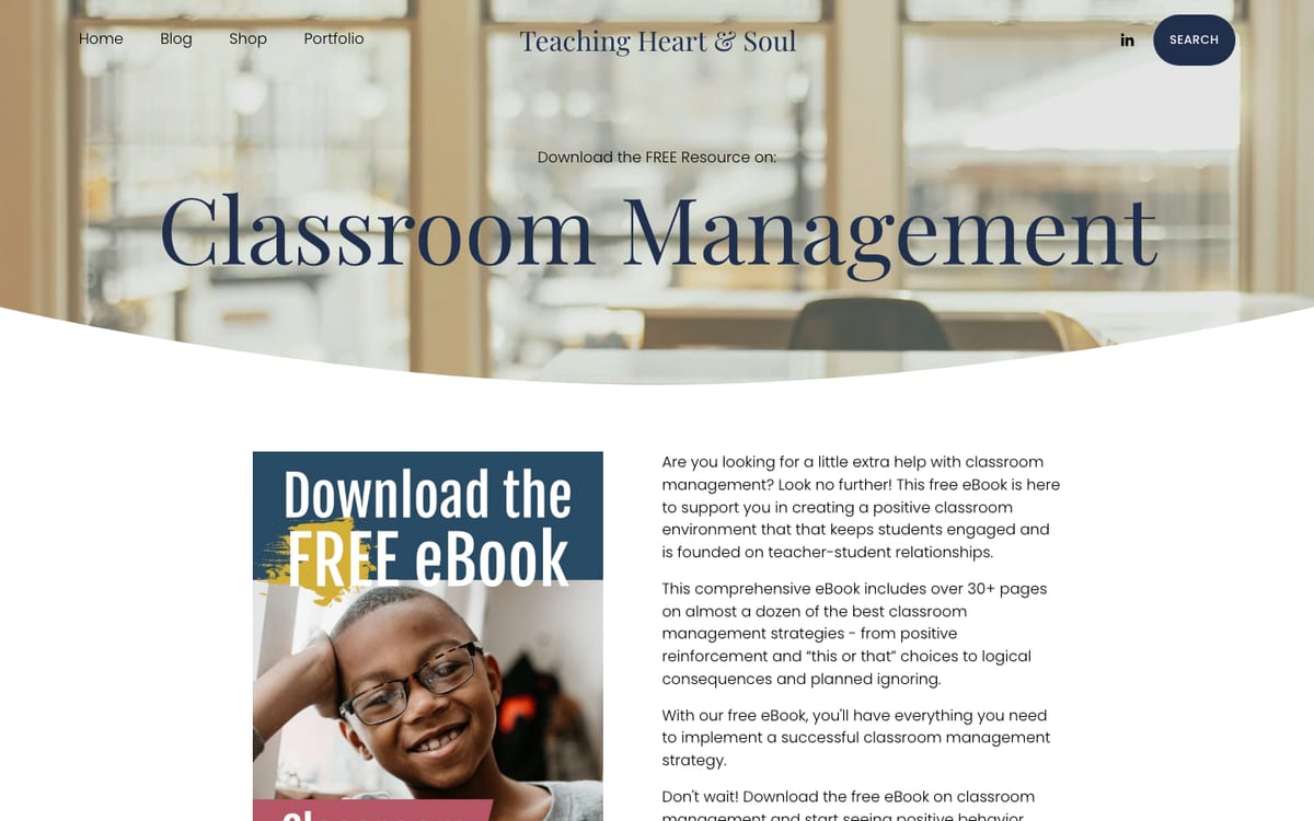
Page: teachingheartandsoul.com free classroom management ebook
Headline: “Download the FREE Resource on: Classroom Management”
First line under it: “Are you looking for a little extra help with classroom management?” The next sentences promise a free ebook that helps teachers build a positive classroom where students stay engaged.
Button: “Download FREE Resource”
What it does well: The headline is the offer itself. The page says what the ebook holds in concrete terms: “30+ pages” on almost a dozen classroom management strategies, from positive reinforcement and “this or that” choices to logical consequences and planned ignoring. The form has three fields (first name, last name, email).
What to copy: Name the page count and two or three real strategies instead of calling it a “comprehensive guide”. Deliver the file right away, with a backup link.
What to add: The page has no bullet list, no author bio, no testimonial and no preview pages, and it keeps the site menu and related links, which give readers exits. Cutting the last name field would also help.
Keep in mind: The image beside the intro is a “Download the FREE eBook” graphic rather than a look at the pages inside.
Paid ebooks
4. Nathan Barry: Authority
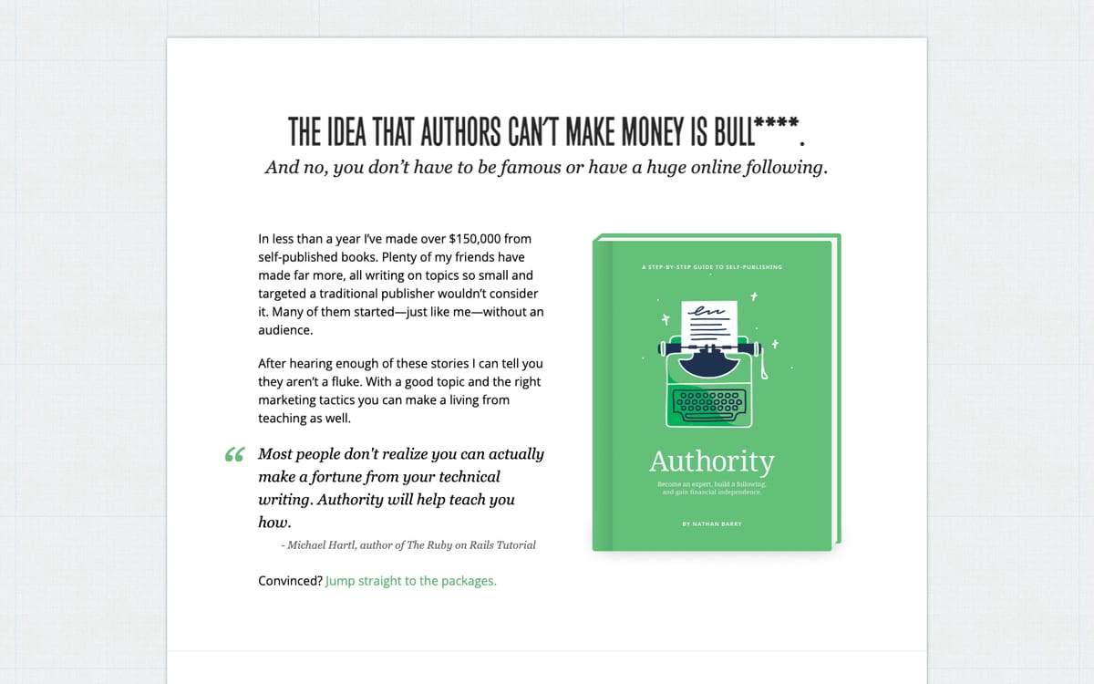
Page: nathanbarry.com/authority
Headline: It argues that the idea authors cannot make money is wrong. The page uses a stronger word than “wrong”. The sub headline adds: “And no, you don’t have to be famous or have a huge online following.”
Buttons: “Buy now for $39”, “Buy now for $199” and “Buy now for $499”
What it does well: This is a long sales page for a book on self-publishing, and it uses the space. It offers three packages, so one ebook serves a $39 buyer who wants just the book and a $499 buyer who wants extras such as videos and interviews. It has a cover mockup, an author bio, quotes from other authors, a four-question FAQ, and a plain refund promise: “If the book’s not for you just email me within 30 days and I’ll happily give you a refund.”
What to copy: A refund line in the FAQ, and two or three price steps if you have extras to offer.
Keep in mind: Package names differed between our two page reads, so we quote only the button prices.
5. Autism Chrysalis: a $10 activity book on Payhip
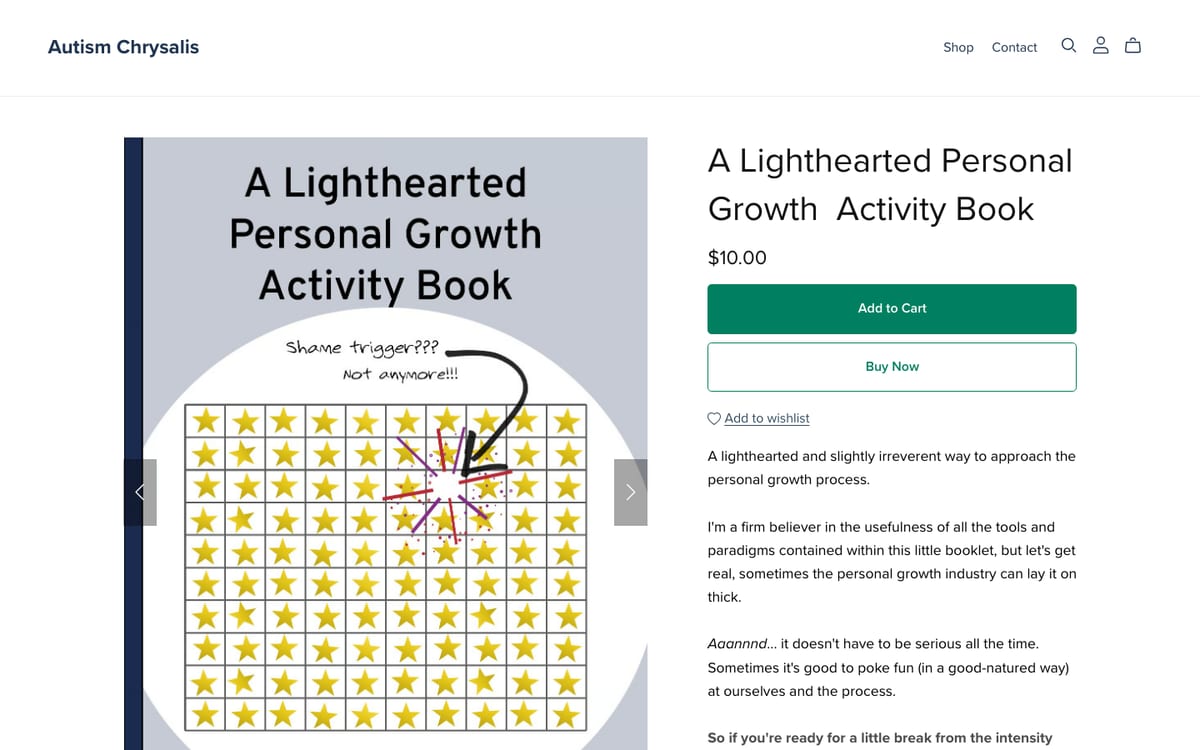
Page: payhip.com/b/KLtuk
Title: “A Lighthearted Personal Growth Activity Book”
Button: “Add to Cart” and “Buy Now”
What it does well: This is the simplest paid page here, and a good model for a small coach or author. It lists the price, then “42 humorous activities”, the file type (PDF), the page count (48) and how delivery works (“a link to download the PDF. Print if desired, or view it on your laptop, tablet or smartphone.”). It also says who the book is not for: “This eBook might not be your cup of tea if you take everything super seriously or if the occasional F-word makes you bristle.”
What to copy: State the page count, file type and delivery in plain words. Tell people who the book is not for.
What to add: The page has no reviews, no preview and no refund line. Those are easy wins if you build something similar.
Free ebooks from big brands
These five pages show good structure. They also show what happens when a company with a known name builds a page, so we flag what not to copy.
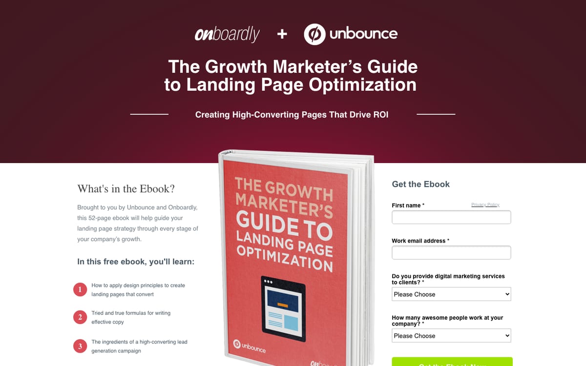
6. Unbounce: The Growth Marketer’s Guide to Landing Page Optimization
Page: get.unbounce.com/growth-marketer-guide
Headline: “The Growth Marketer’s Guide to Landing Page Optimization”
Sub headline: “Creating High-Converting Pages That Drive ROI”
Button: “Get the Ebook Now”
What it does well: The title is the headline, and the sub headline says what the reader gets. The page has a cover image, four bullets such as “Tried and true formulas for writing effective copy” and the page count (52). It shows no main menu, and the form has four fields: first name, work email, and two dropdown questions.
What to copy: The two dropdowns let Unbounce sort its list. A small publisher can ask one such question, since each extra field costs some signups.
Do not copy: The page leans on borrowed trust from a well-known blog and a row of publication logos. Only show logos or quotes you have earned.
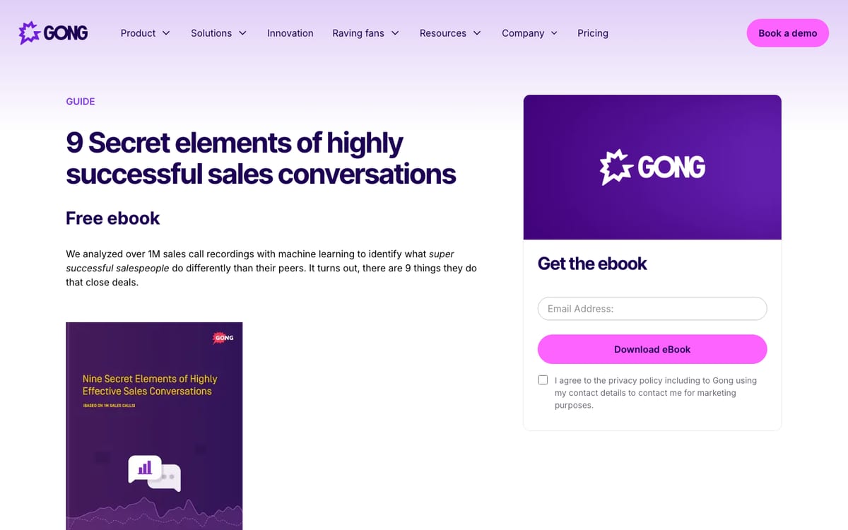
7. Gong: 9 Secret Elements of Highly Successful Sales Conversations
Page: gong.io guide page
Headline: “9 Secret elements of highly successful sales conversations”
Button: “Download eBook”, under a form headed “Get the ebook”
What it does well: The sub headline puts the proof first: “We analyzed over 1M sales call recordings with machine learning to identify what super successful salespeople do differently than their peers.” The bullets tease a surprise, such as why the best salespeople “never ‘mirror’ their prospects, despite conventional wisdom telling them otherwise”.
What to copy: Lead with one surprising finding from your own work. A real number works even if it is small, such as “from 40 client projects”.
Do not copy: The “1M recordings” number comes from Gong’s own product data. Never inflate a number. The page also keeps the full site menu, which gives readers an exit.
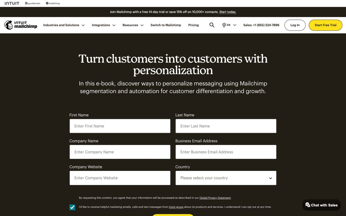
8. Mailchimp: Turn clustomers into customers with personalization
Page: mailchimp.com e-book page
Headline: “Turn clustomers into customers with personalization”
Button: “Download the e-book”
What it does well: It backs its claim with one cited statistic: “9 in 10 marketers agree that personalization is the most successful strategy they’ve used”, with a footnote crediting a 2023 survey. The bullets are benefits, such as “Tailored experiences can strengthen connections”.
What to copy: One real statistic with its source builds trust fast.
Do not copy: The form asks for six things, including company website and country, which is too much for a free ebook from an unknown author. The made-up word in the headline only works for a brand people already know.
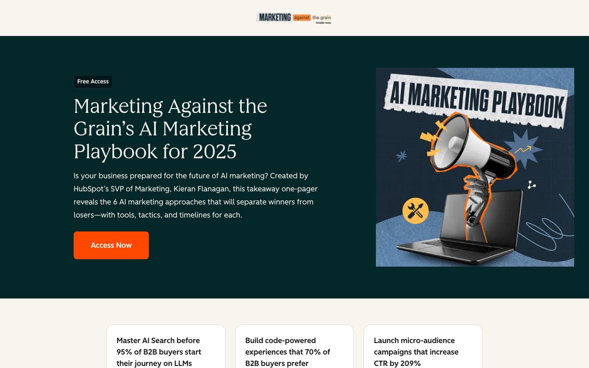
9. HubSpot: Marketing Against the Grain’s AI Marketing Playbook for 2025
Page: offers.hubspot.com/matg-ai-marketing-playbook
Headline: “Marketing Against the Grain’s AI Marketing Playbook for 2025”
Buttons: “Access Now” and “Grab Yours Today”
What it does well: It names a real person with a job title in the sub headline (Kieran Flanagan, HubSpot’s SVP of Marketing) and says honestly that this is a “takeaway one-pager”, not a full book. Each bullet pairs a topic with a tool or a number.
What to copy: Say the true size of what you are giving away, and name yourself and one credential.
Do not copy: The page rides on a popular podcast and HubSpot’s name. The percentages in the bullets have no source on the page, so do not quote numbers you cannot back up.
10. Unbounce: The 23 Principles of Attention-Driven Design
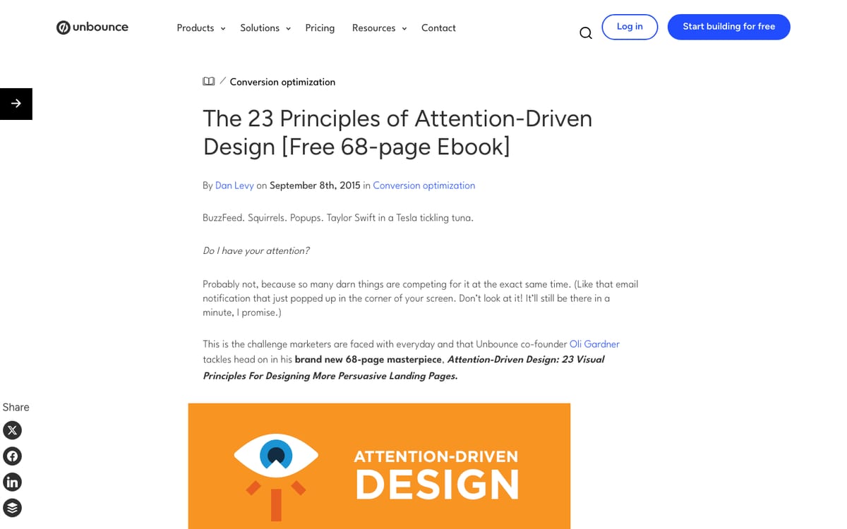
Page: unbounce.com attention-driven design ebook
Headline: “The 23 Principles of Attention-Driven Design [Free 68-page Ebook]”
Button: “Download the eBook now”
What it does well: The headline states the number of ideas, the price (free) and the length (68 pages), so the offer is clear before the reader scrolls. The bullets are specific and odd, such as a test of the author’s own mugshot on a landing page button, which sells curiosity better than “learn best practices”.
What to copy: Put the format and size in the headline. Make bullets specific.
Do not copy: The form has nine items, including company name, number of employees and a free-text comments box. That is heavy for anyone without a big brand. The bracketed text in the headline is also a blog habit, not good landing page copy.
The 10 pages side by side
| Page | Free or paid | Form fields we could see |
|---|---|---|
| Justin Welsh | Free | 1 (email) |
| Joanna Penn | Free | 1 (email) |
| Teaching Heart & Soul | Free | 3 (first name, last name, email) |
| Nathan Barry | Paid ($39, $199, $499) | None on the page, buttons go to checkout |
| Autism Chrysalis (Payhip) | Paid ($10) | Standard Payhip cart |
| Unbounce, Growth Marketer’s Guide | Free | 4 |
| Gong | Free | 1 (email), plus a consent box |
| Mailchimp | Free | 6, plus an opt-in box |
| HubSpot | Free | 1 to start (email) |
| Unbounce, Attention-Driven Design | Free | 9 |
The pattern is clear. The solo creators keep things short and specific. The big brands ask for more, because they can afford to lose some signups for better lead data. If you are starting out, you probably cannot.
What the numbers say
Be careful with landing page statistics. Many of the ones you see online come from a vendor’s own data, or from a study nobody can trace. These are the ones we could trace to a source.
- Typical conversion rate: Unbounce’s Conversion Benchmark Report puts the median landing page conversion rate at 6.6% across industries (Q4 2024 data, over 41,000 pages). Kit says the average landing page for creators converts at around 2%, though it does not show its method. Your own rate will depend on your traffic, so use these only as rough anchors.
- Ebook-specific rates: We found no independent benchmark. You may see a figure like 24% for ebook pages. It comes from one landing page vendor’s own customers with no method shown, so we do not use it.
- Fewer form fields: HubSpot’s analysis of more than 40,000 landing pages found that conversion rates fall as fields are added, though less steeply than the author expected. The advice that follows is to use as few fields as you can, and to be extra careful with text boxes and dropdowns.
- One goal: In Unbounce’s 2018 analysis of 18,639 pages, pages with a single link converted at 13.5% on average, against 10.5% for pages with five or more links. That is a correlation from older data, not a controlled test. CXL’s roundup of case tests shows mixed sizes, so say “often helps”, not a fixed number.
- Mobile: Unbounce’s 2024 report says 83% of the visits it analyzed were on mobile, and that desktop converted 8% better than mobile. Check your page on a phone before you publish.
- Social proof: The same 2018 Unbounce data found pages with social proof converting at 12.5% against 11.4% without it, again a correlation. Nielsen Norman Group makes the same point in words: showing that other people like your product removes some doubt.
- Plain language: Unbounce’s report says copy written at a 5th to 7th grade reading level converted at 11.1%. That fits the advice to keep your copy simple.
We found no solid study on how much a cover mockup or a “what is inside” list changes downloads, so we make no claim about it.
How to build yours
You do not need a builder to start. Use your email tool, Payhip, Gumroad or your own site, and follow this order from top to bottom.
- Headline: The result the reader gets, in plain words. Include the format and size, such as “a free 12-page checklist”.
- Sub headline: One line of proof, such as how many clients, years or interviews it comes from. Only use true numbers.
- Cover or mockup: A clean image of the ebook. Our free ebook cover mockup generator makes a 3D version from a flat cover.
- Four to six bullets: What the reader will know or be able to do. Make each one specific.
- The form or buy button: For a free ebook, ask for a name and email, or just an email. Name the item on the button, such as “Send me the checklist”.
- Proof: A short bio, one real quote, or a refund promise for paid books.
- A privacy line: One sentence near the form on how you use the email, with a link to your privacy policy.
- A repeat of the button at the bottom of the page.
Then set up the part most examples skip: the thank-you page and the delivery email. The thank-you page should confirm that it worked, give the download link right away, and offer one next step. Send the same link by email, in case the reader closes the tab.
If you need an idea for the ebook itself, the lead magnet generator suggests five. Our guide to creating a lead magnet ebook covers the ebook, and this post covers the page that gets it downloaded.
Mistakes that hurt ebook landing pages
- A vague headline. “Free ebook” tells nobody what is inside.
- A long form. Unbounce’s attention-driven design page asks for nine things. Start with two.
- A menu bar. Every extra link is a way to leave.
- Invented proof. Do not borrow logos, fake numbers or quotes. A small true claim beats a big false one.
- No mobile check. Open the page on your phone before you share it.
- A broken delivery. Test the download link and the email yourself.
FAQ
What is an ebook landing page?
It is a single web page built to get a visitor to do one thing: download your ebook for free, usually in exchange for an email, or buy it. It has no other goal, and it usually has no menu bar.
Do I need a landing page for my ebook?
If you give the ebook away to collect emails, yes. A focused page converts better than a link to your home page, because the visitor sees one offer and one button. If you sell it on a store like Amazon, the store listing is your page.
What is a good conversion rate for an ebook landing page?
There is no reliable ebook-only benchmark. Unbounce’s median for all landing pages is 6.6%, and Kit reports about 2% for creators. Judge your page against your own results over time.
How many form fields should I ask for?
As few as you can. For a free ebook, an email address is often enough, and a name and email is common. Add a question only if you will use the answer.
Should I remove the navigation menu?
It often helps, because it leaves one goal on the page, but the effect varies and is not guaranteed. Case tests collected by CXL range from small gains to large ones.
What should the thank-you page say?
Say it worked, give the download link, tell them to check their email, and offer one next step, such as reading a related guide. Do not add five choices.
Can I make the ebook and the landing page with AI?
Yes. Koobe can build the ebook, and then you put it on a simple page using the layout above. Read and edit everything it writes before you publish, and add your own examples and details.
Where Koobe fits
A landing page needs an ebook worth downloading. Koobe turns an idea into a complete nonfiction ebook: an outline you can edit, chapters, four cover options and store-ready files. Your first book is free to create and preview, and plans start at $23 a month billed yearly. Use the cover on your landing page mockup.
Describe your book in a sentence. Koobe plans the chapters, writes them, designs the cover and exports a PDF and EPUB. Your first book is free.

“Files were ready for KDP, which is what I actually needed. First book I’ve finished.”